


VIU is a digital insurance platform developed by HUB International to make the process of obtaining insurance easier and more accessible by allowing consumers to get quotes, access coverage, and manage their policies digitally.
This project takes a look at how the main Button component in the design system was redesigned to resolve usability issues throughout the platform.
*To comply with my non-disclosure agreement, I have omitted and obfuscated confidential information in this case study. The information in this case study is my own and does not necessarily reflect the views of HUB International.
*This case study is condensed for easier viewing. To view the full case study, please shoot me an email.
The Button component redesign consisted of several stages:
An audit to identify component and usability issues
A redesign proposal that solves the problems found
Reorganizing and updating the design system with the redesigned components
Proposing new UX/UI patterns with the updated component
Documenting the new component and its patterns
Publishing all the updates, deprecating previous iterations, and implementing the updates into existing design files
Problems


Solutions
Less is more
Mobile and desktop versions were consolidated into one consistent design to reduce discrepancy with design and development

How do other design systems do it?
I did a deep dive into several well-established design systems such as Material Design, Ant Design, Polaris, Adobe Spectrum, Atlassian, and Lightning to see what common patterns and design elements were being used that users would be most familiar with.

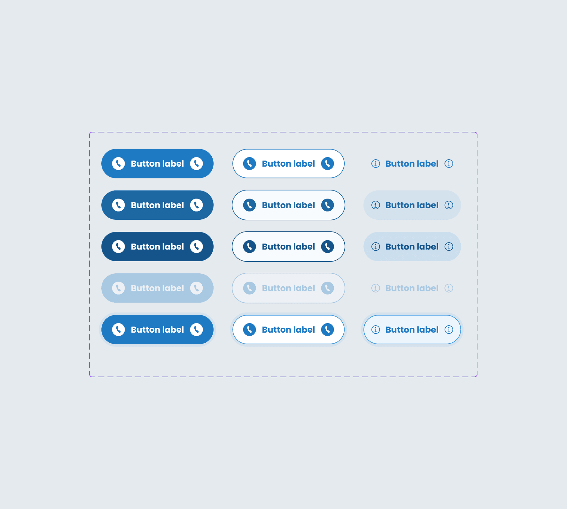
Resolve usability issues caused by inconsistent patterns
Because the buttons were being used without a clearly defined guideline, it resulted in inconsistent patterns, which produced usability. One example is the input validation issues caused by disabling buttons in an empty input form. We redesigned the pattern to enable buttons and use live feedback such as input error messages in order to deliver a clearer, more consistent experience.

Organize
By rebuilding and reorganizing the component to incorporate all the properties that previously were separated into unique variants, we were able to simplify the design library while optimizing the functionality of the button.
Publishing
Impact
The Button component in the design library was cleaned up, and the redesign resulted in a reduction of unnecessary variants. We were able to consolidate over 60 variants to 15.

Consistent design
The updated Button component allowed designers and developers to keep the button design consistent for both the UI design as well as UX patterns throughout all the pages, creating a seamless and thoughtful experience for end users.

Domino effect
Redesigning the Button component to resolve issues within the component itself had a chain reaction in resolving design issues and improved usability overall. Users experienced fewer misunderstandings in their interactions.
Hanbi Lee 2025
Toronto, Canada