User Research


We received feedback via the technical support form on the Nexus page from users looking for information on how to sync their external policies.
Based on this client interaction, we wanted to look at methods for surfacing feature and providing users with instructions on how to use features.
This project takes a look at how to provide users with instruction for accomplishing account dashboard specific tasks (e.g., importing policies, updating policies, etc.).
*To comply with my non-disclosure agreement, I have omitted and obfuscated confidential information in this case study. The information in this case study is my own and does not necessarily reflect the views of HUB International.
*This case study is condensed for easier viewing. To view the full case study, please shoot me an email.
My role in this project was primarily to research, ideate solutions based on the research, and to present the ideas for further development. I considered the following to guide my design strategy:
Outline potential tasks that can benefit from this type of feature
Provide options for the most helpful way to present this information
Determine if there are potential flow/copy improvements that might achieve the same goal
Sort options by complexity of implementation
Research
The first step was figuring out what areas users were most struggling with. From the technical support form, I was able to gather a list of use cases users found challenging to accomplish.
After conducting a thorough search of all the established features that provided instructions for users, I noted the pros and cons of each, the technical cost of implementation, as well as how each feature might look and function when implemented in the specific use cases we were looking at.
Testing

In-App Walkthrough
In-app walkthroughs were effective in reducing friction and helping users adopt new features faster but were more helpful when the user first entered the app, but otherwise tricky to implement.

Product Tour
Product tours helped users familiarize with the product, but provided too much irrelevant information, and almost 80% of users skipped product tours when there are more than 5 steps.

Checklist
Checklists allowed users to willfully manage their own onboarding, but it was important not to overwhelm users with too many steps.
Feature Guide
Feature guides allowed more flexibility for the user to interact with it compared to more lengthy walkthroughs, but it had the potential to disrupt the user’s natural flow and were less effective on mobile screens due to size limitations.

Announcement Modal
Announcement modals were non-intrusive / non-disruptive if timed well. For instance, when used to announce new features or content, modals sparked curiosity and motivated users to explore the app in more depth.

FAQ
FAQ pages were helpful in addressing broad, common issues and were scalable. However, they failed to address specific questions users had and a lack of interactivity made following instructions feel complex and difficult to apply immediately.
Findings

Comparison Chart
I drew up a chart that consolidated all my findings for easier conceptualization of the solution, and so that the solution was evidently backed by research. The findings pointed to Announcement Modals being the most effective solution, followed by a supplementary implementation of External FAQs and Feature Guides.
Proposal
The first course of action would be to comb through the problematic areas users were having trouble with and seeing if there was a simpler, direct solution.
For instance, if the user found it difficult to find how to import their policies because it did not clearly look clickable or its placement was not apparent, we redesigned the feature to use a button from the design system and repositioned it alongside other buttons where users would find it more easily.
In implementing the presentation of instructions to users, the final proposal consisted of a combination of features, which used in tandem, would effectively equip users with simple tools to help them navigate the product.
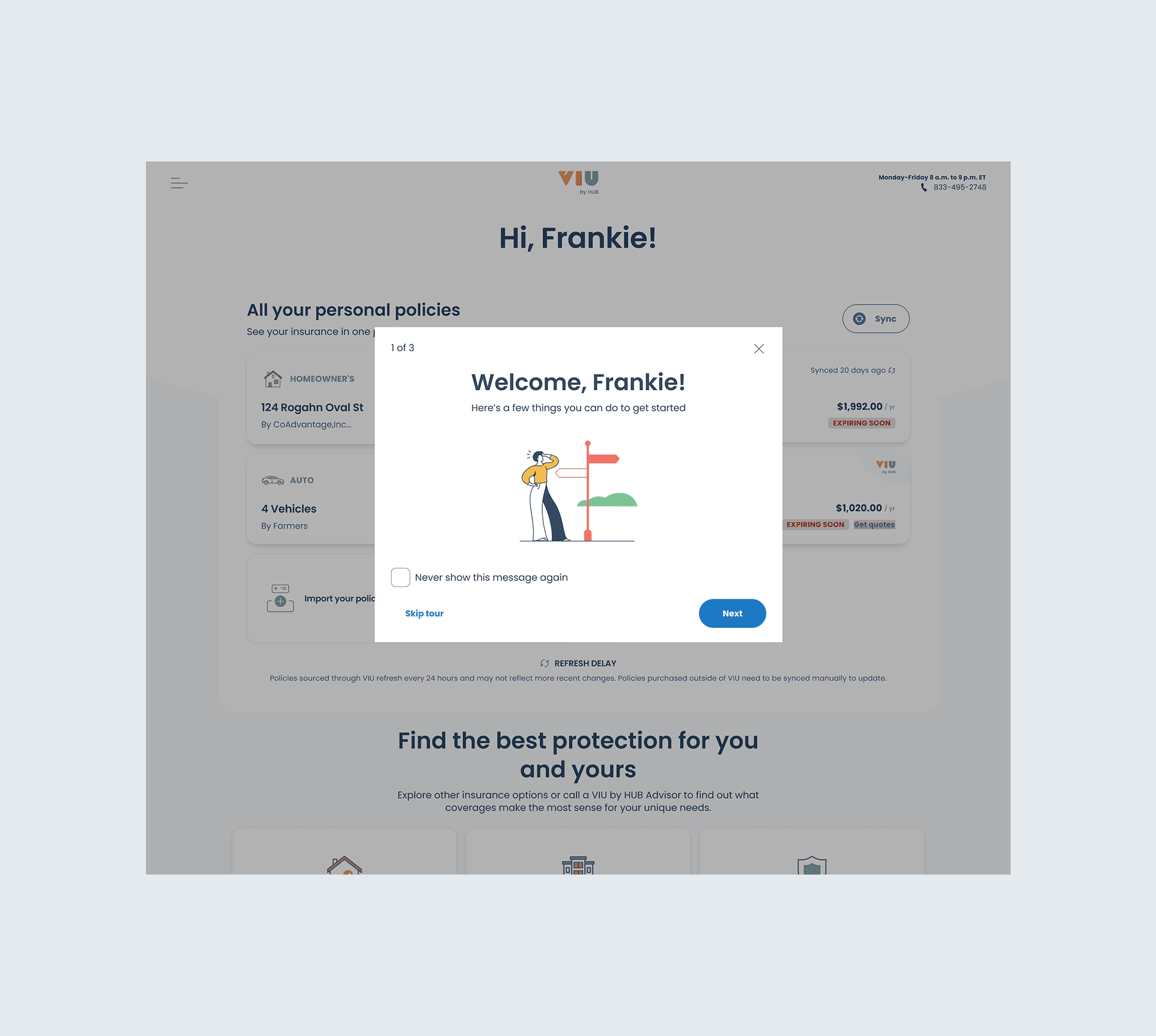
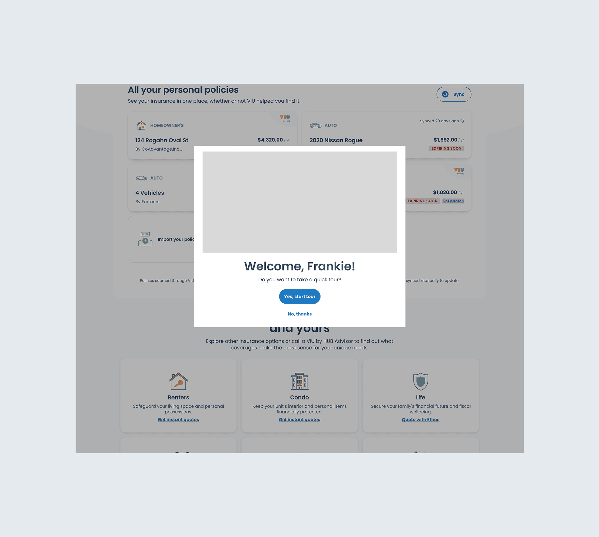
First Login
At the first login, a concise announcement modal would help guide users through the most relevant features. The user would have the option of skipping the modal.

External FAQ
If users had other questions while using the product, they could always resort to the external FAQ, which would contain step-by-step instructions to common questions, as well as a submission form allowing users to ask specific questions.

In-App Walkthrough
Each FAQ page would also contain a link to an in-app walkthrough. The in-app walkthrough would help users familiarize themselves with the specific task they wanted to accomplish, but limit the scope of the walkthrough so they did not need to cover information they did not need.

Help Tooltip
Lastly, tooltips would be positioned in areas we found users commonly had questions about so they could directly get answers to their questions without having to navigate elsewhere for help.
Hanbi Lee 2025
Toronto, Canada